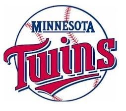
Old Logo
New Logo
Well what do you think?
Obviously the changes are minor, the most noticeable being the navy colored ring around the baseball that says Minnesota Baseball Club inside of it. A change that is a little less noticeable to the every day person is the new TWINS font. First off the font is less block like, now with sharper edges on all the letters especially the S in Twins. Also there is no longer an embedded navy shadow highlighting the red Twins font, instead the font now has a bold navy outline all along the letters. You'll also notice that the baseball has been rotated so the stitching no longer runs through the Twins font. The stitching size was also increased which makes the proportions of the ball more accurate to real life.
JERSEYS:

The changes to the Navy Alternate Away jersey are subtle as only the new font has changed on the front of the jersey. However the Gray Away jersey got a complete over haul as the Pin stripes have been washed away and the Block letters were demolished in favor of this cursive script, that is supposedly based on the original Minnesota scrip found on team jackets back in 1961.
As you can probably see by looking at the jerseys is that there are new commemorative patches on both sleeves of the jerseys here is a look at them:
As you can probably see by looking at the jerseys is that there are new commemorative patches on both sleeves of the jerseys here is a look at them:


Comments